How a Mega Menu Quietly Blocks Ecommerce Revenue (And How We Fixed It)

Rabia Sabir
Jan 20, 2026 · 4 min read
I help eCommerce brands identify silent conversion leaks through UX and navigation optimization, especially in high-consideration categories.
A real CRO lesson from the Limitless Living MD project
Limitless Living MD is a premium wellness brand that sells medically guided solutions for weight loss, hormone support, recovery, and longevity.
High intent traffic. High average order value. But… users were hesitating early.
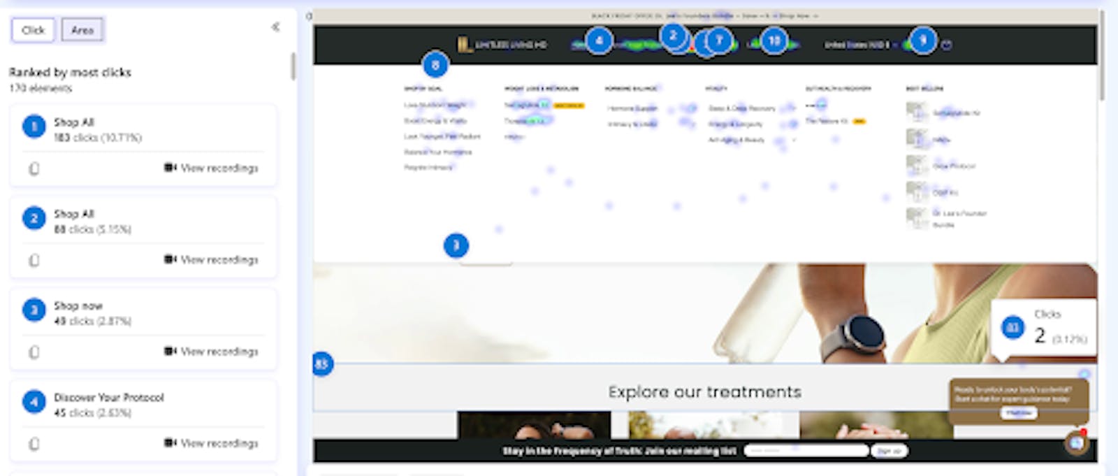
Session recordings showed the same pattern:
- Users opened the mega menu
- Scanned options
- Hesitated
- Clicked randomly or bounced
The problem was not the products.
The problem was how choices were presented. ✘ The First Mega Menu (A Costly but Common Mistake)
Live before 31st October
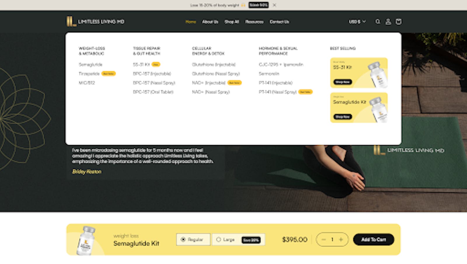
My first iteration was clean and visually neat.
But it failed.
Why?
Because it was brand-centric rather than goal-centric.
What went wrong:
- Categories were too generic
- Product names assumed medical knowledge
- No guidance for first-time users
- All options looked equally important
- No visual or cognitive hierarchy
In short:
We made users think at the exact moment they needed reassurance.
From a revenue perspective, this matters because every extra second of hesitation at the navigation level compounds across thousands of sessions.
Result:
❌ Confusion ❌ Slower decisions ❌ Lower menu-to-product click-through
This version looked good.
But it did not convert.
✔ The Turning Point: Treating Navigation as Revenue Infrastructure
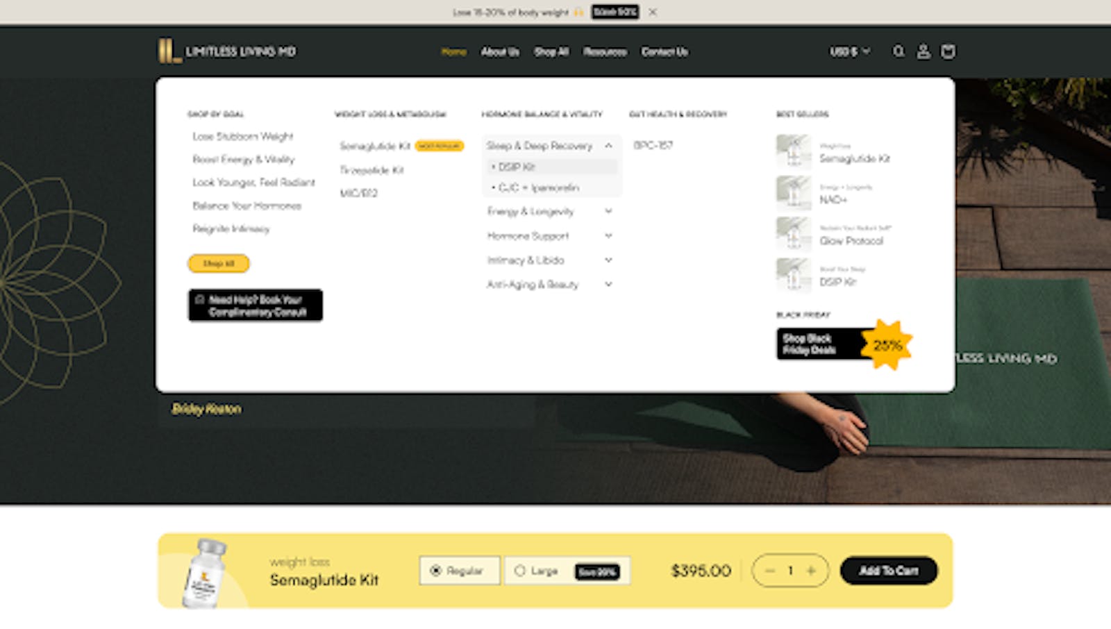
Shipped on 31st October
The fix didn’t involve a redesign, rebrand, or new funnel.
We changed how decisions were framed.
We shifted from:
“What we sell”
To:
“What problem does the customer want to solve?”
Instead of asking visitors to decode products, we helped them self-identify quickly and confidently.
Most importantly, we treated the mega menu as a system-level constraint, not a cosmetic element.
HEAT MAPS:
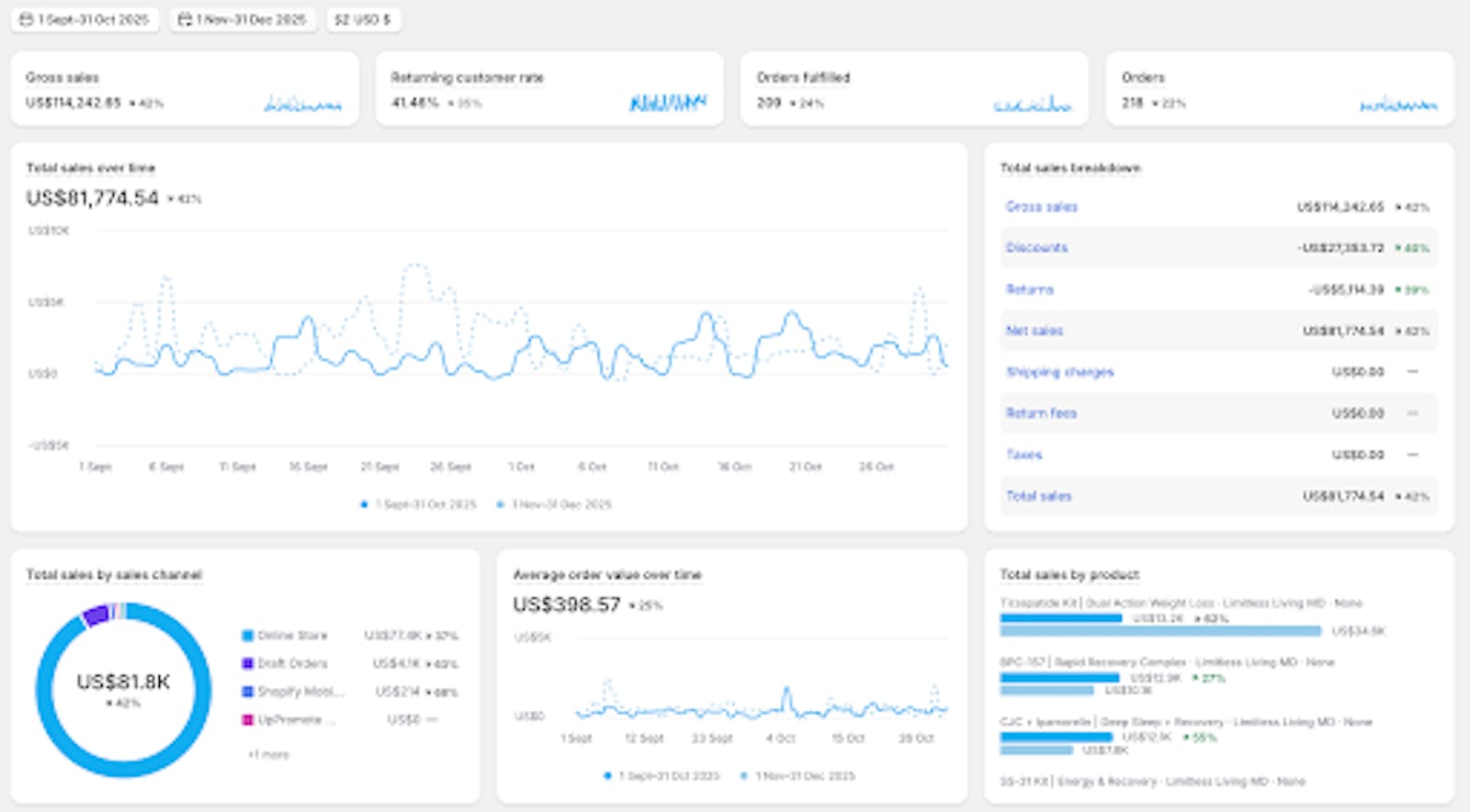
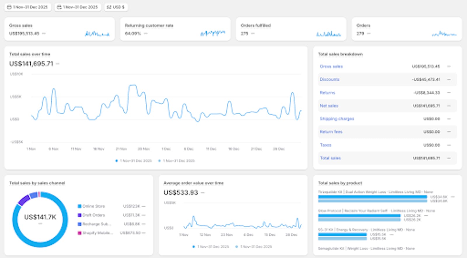
RESULTS:
What We Changed (And Why It Worked)
1. We Organised by User Goals, Not Products
2. We Reduced Cognitive Load
3. We Added Visual Anchors for Fast Recognition
4. We Created a Natural Path to Action
Why This Works (Beyond This One Store)
After this project, the pattern became very clear.
High-converting mega menus aren’t about trends, animations, or clever layouts.
They work because they:
- Reduce mental effort early
- Guide instead of listing
- Remove the fear of choosing wrong
- Help users move forward faster
For e-commerce owners, this is high-leverage work because navigation affects every session, not just a single page.
What High-Converting Mega Menus Have in Common (With Real Patterns)
After this experiment, a clear pattern emerged.
High-converting mega menus are not about layout trends. They are about how decisions are framed.
Below are the exact patterns that consistently perform well and directly reinforce what worked for Limitless Living MD.
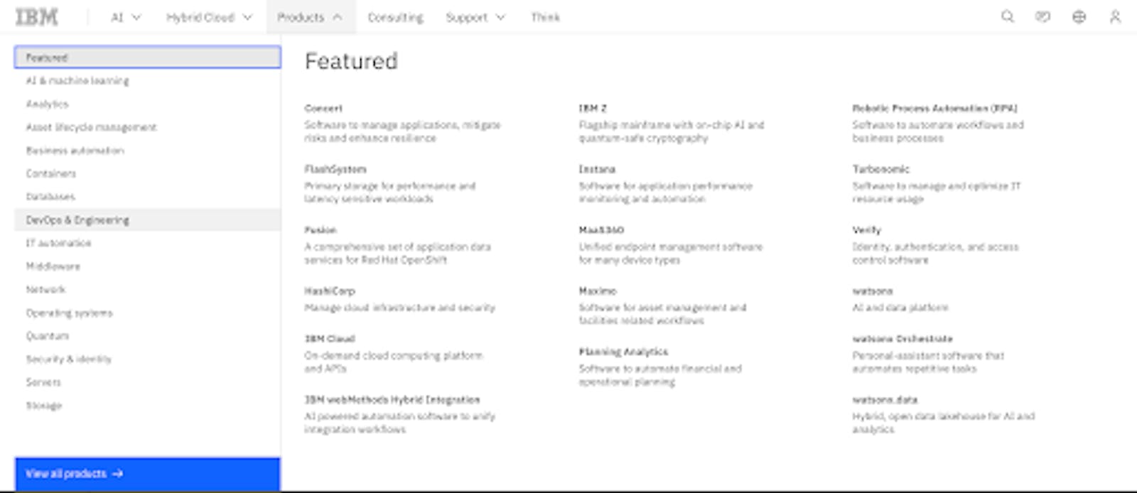
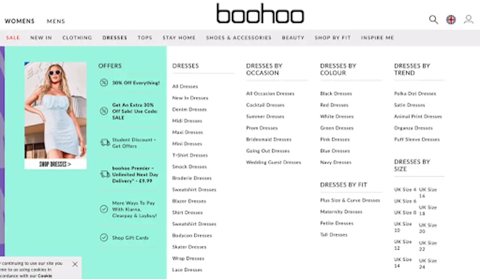
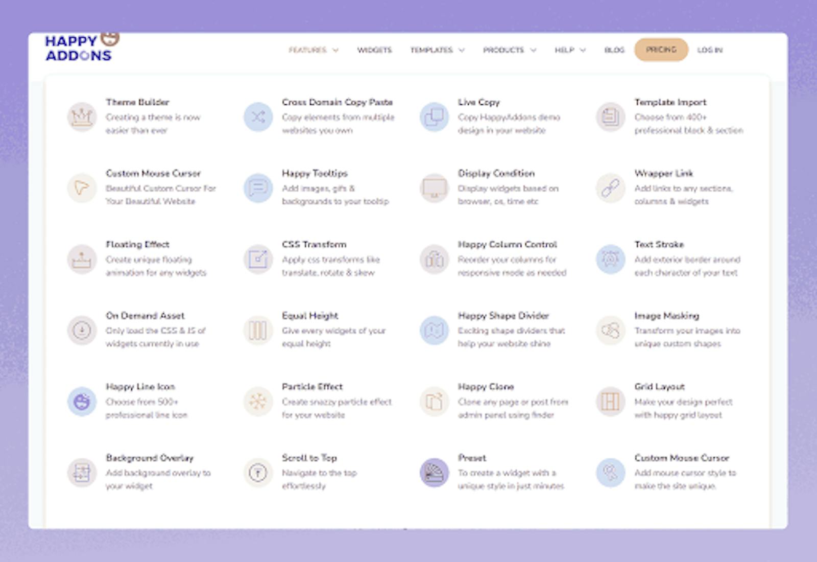
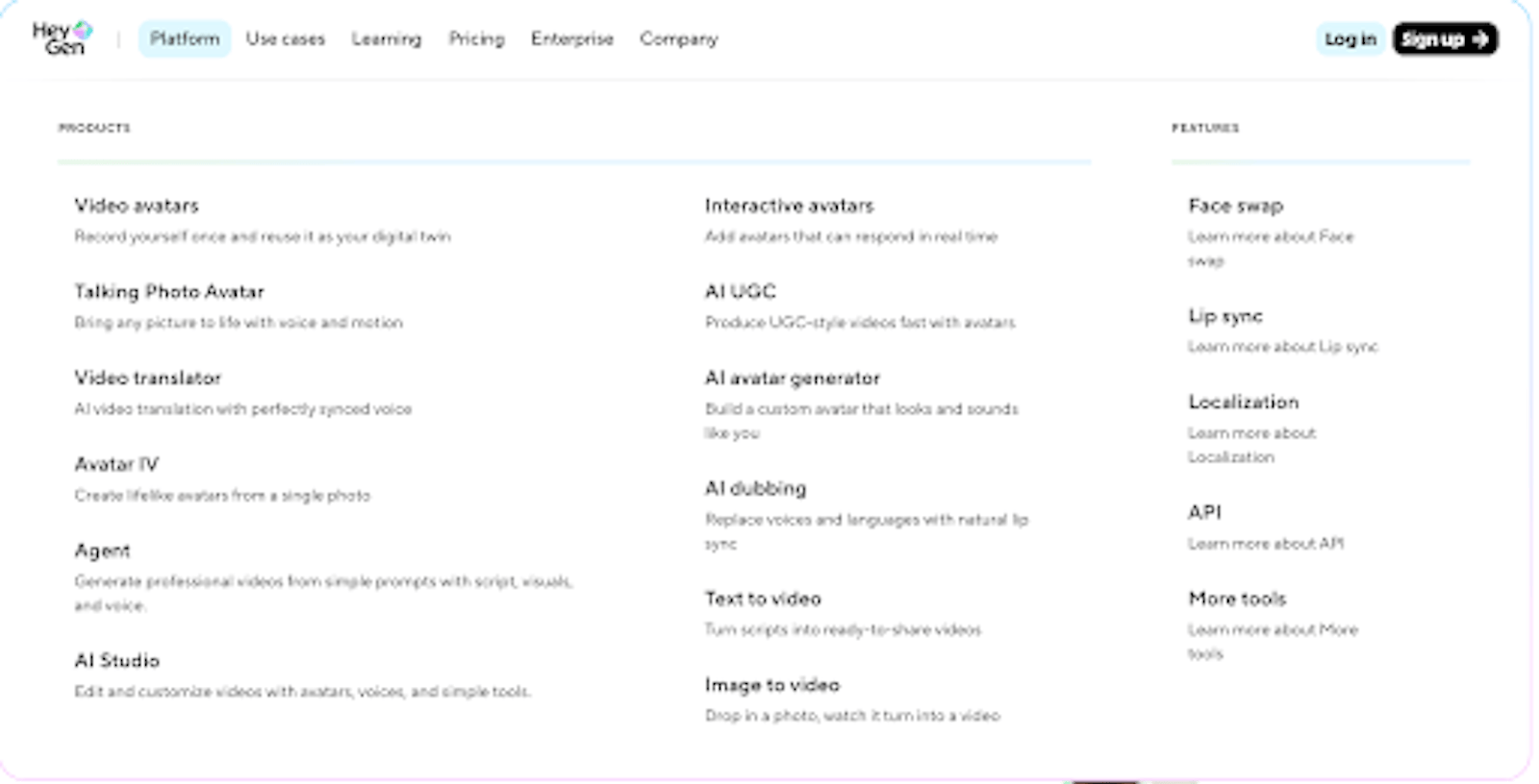
1️⃣ Goal-Based Mega Menus (Best for Complex Decisions)

Why users respond to this:
Users don’t want to browse categories. They want to confirm they are in the right place.
Instead of asking: “Which product should I choose?”
The menu asks: “What are you trying to achieve?”
🔁 This is the exact mental model that unlocked performance at Limitless Living MD.
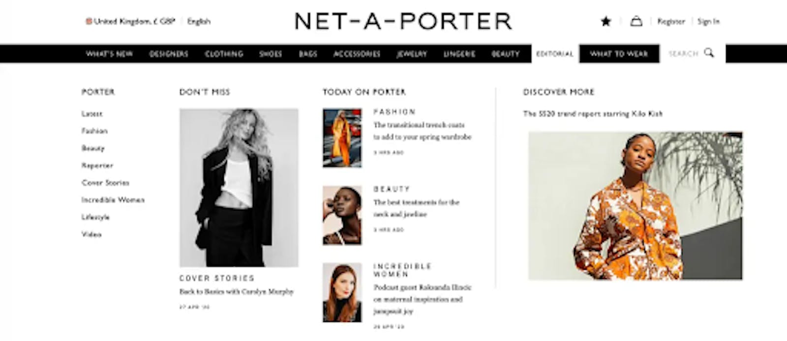
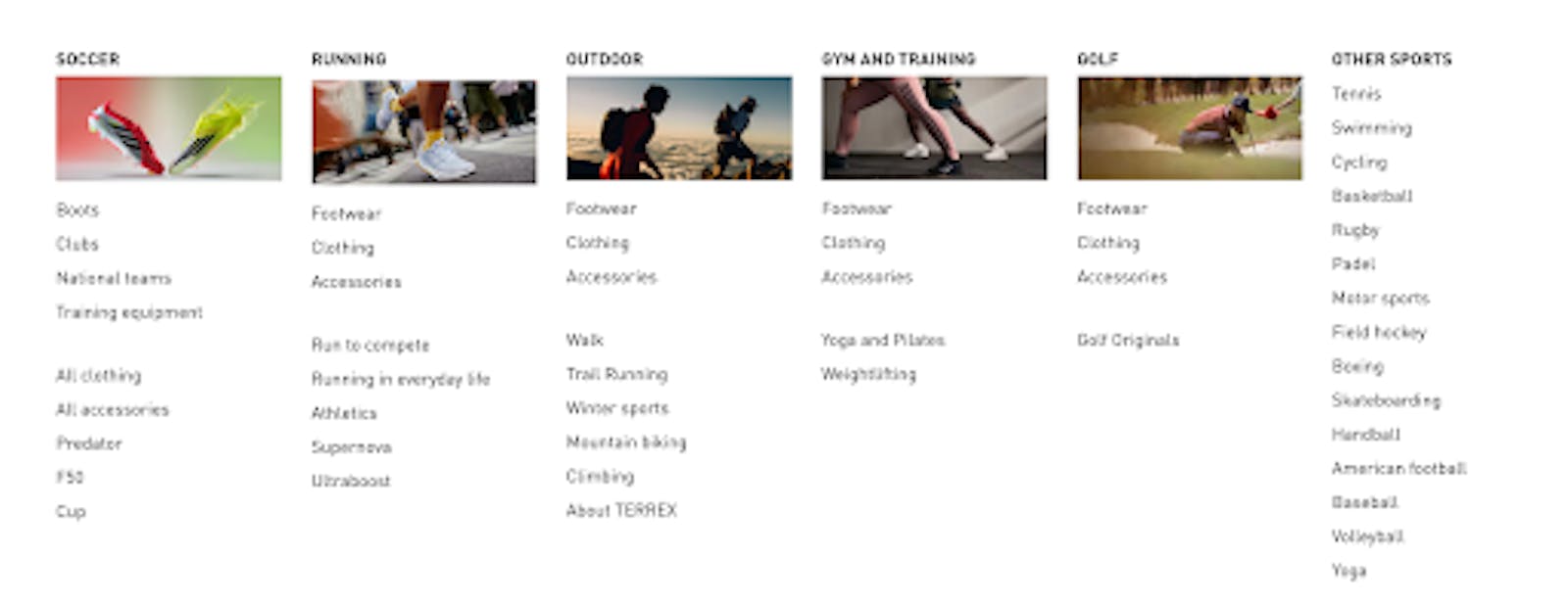
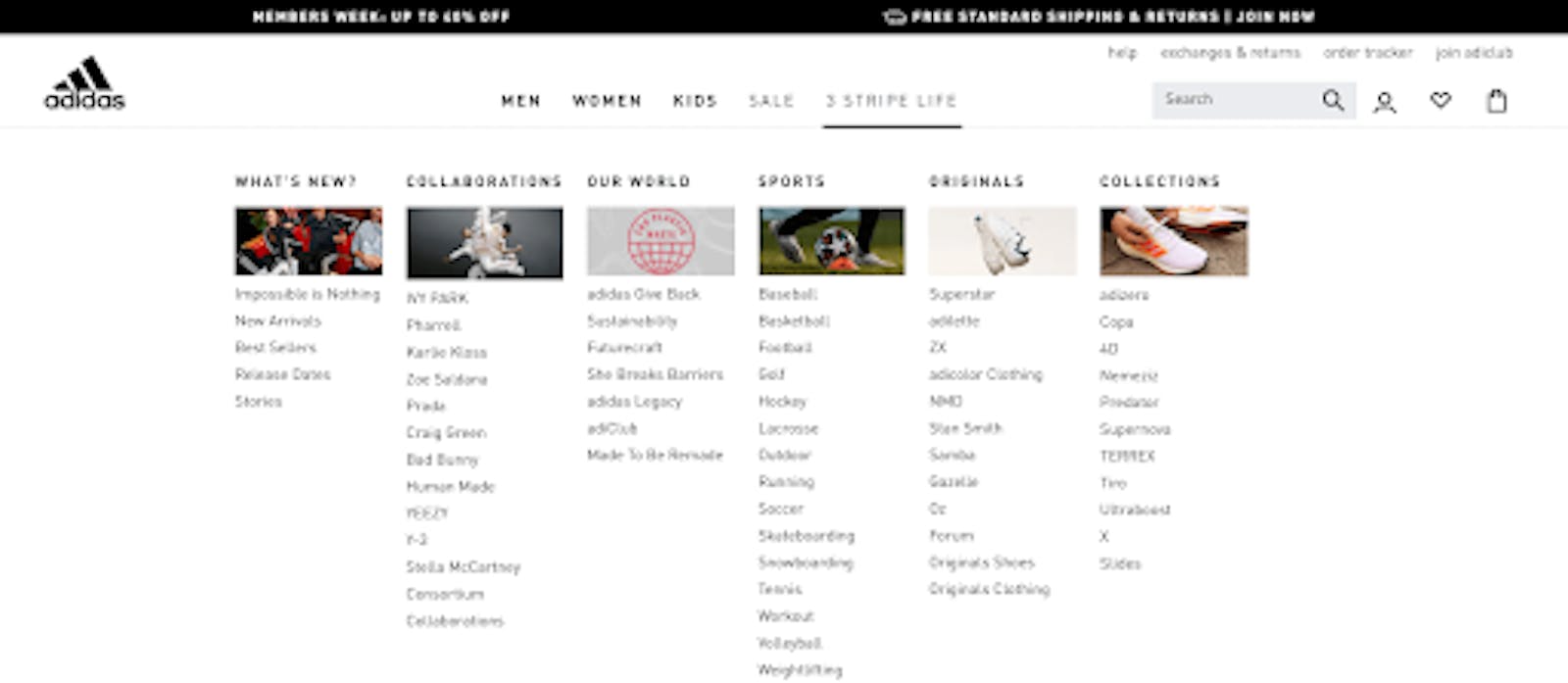
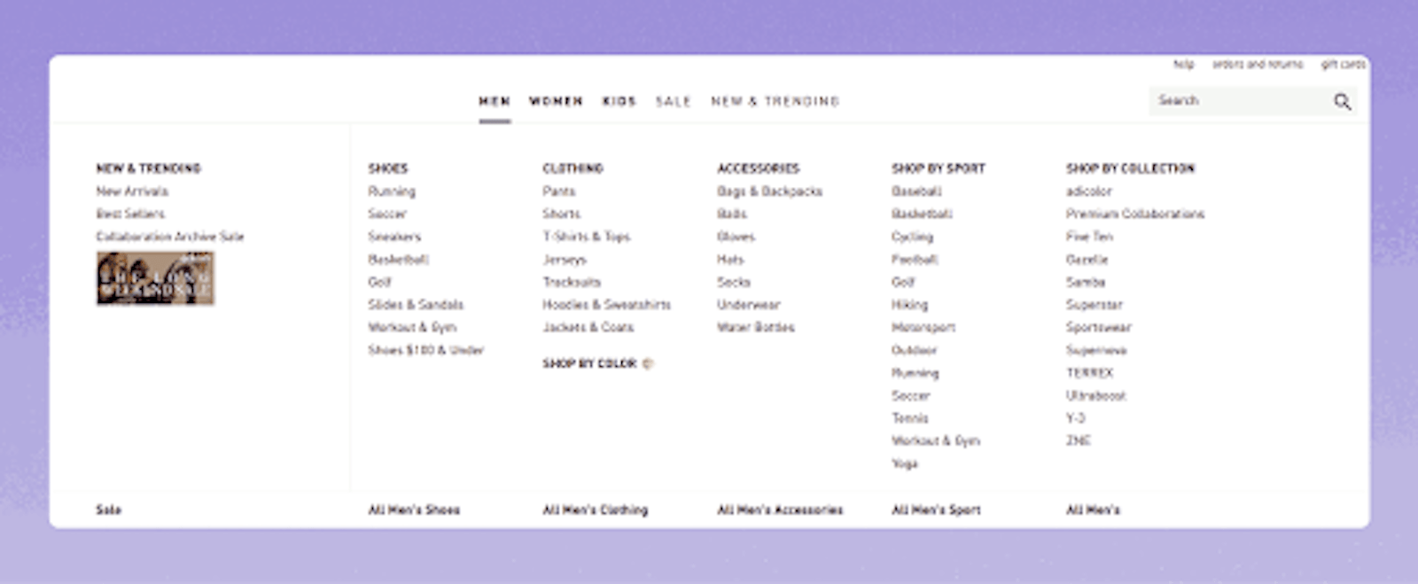
2️⃣ Best-Seller-First Mega Menus (Speed Over Exploration)
Why users respond to this:
When users feel uncertainty, they copy the “safe option.”
Highlighting best sellers:
- Reduces anxiety
- Accelerates decisions
- Increases menu-to-product clicks
This works especially well when 20 percent of products drive most revenue.
3️⃣ Guided / Assisted Mega Menus (“Help Me Choose”)
Why users respond to this:
It removes responsibility from the user.
Instead of forcing choice, it offers guidance:
- Narrowed paths
- Clear next steps
- Reduced fear of choosing wrong
This pattern is particularly effective for first-time buyers and medically sensitive categories.
The Real CRO Lesson
Mega menus don’t fail because they look bad.
They fail because they ask customers to work too hard before making a purchase.
If a first-time visitor can’t understand where to go in under a few seconds, your navigation is likely costing you revenue — even if everything else looks “fine.”
And the most dangerous part?
This loss is silent. It scales with traffic. And it’s rarely fixed by ads or discounts.
Final Thought
Most teams look for conversion wins inside pages.
In my experience, the highest leverage often sits above them — in how users are guided, reassured, and allowed to choose.
That’s why I don’t treat navigation as UI.
I treat it as core revenue infrastructure.
Sometimes, the highest-impact CRO wins don’t come from redesigning pages, but from reordering information to match how users think.
If your users browse but don’t buy, start with your navigation.
It might be silently holding back your revenue.
Is Your Navigation Quietly Blocking Revenue?
I offer a short CRO navigation audit where I review your menu structure, decision flow, and UX hierarchy, and highlight the biggest friction points holding conversions back.